

Engagemap
Helping executives make smarter business decisions.
Background
Duke Energy business stakeholders have requested Digital Product Design to create a map that aggregates key enterprise data on an intuitive and compelling map.
Engagemap will be used to communicate information from Duke Energy representatives to government officials about how Duke Energy is involved in their communities. The two primary users are Community Relationship Managers (CRMs) and Corporate Communications Analysts.
Problem
Duke Energy is a Fortune 200 company with assets across the United States. A company this size brings difficulty in aggregating large amounts of up-to-date data tied to a specific region. Business stakeholders were open to new ideas on how to best represent this but did ask that we include a long list of data types in the MVP release.
Stakeholders anticipate adding new data layers in the future as well as a “circle tool” where a user can circle an area and find out information within that circled area. Data currently is primarily aggregated at the county level with a few data sets aggregated at the ZIP Code level. This problem will be solved post-MVP.
UX Project Roadmap
Goals
Overall, this application is meant to show users information about a specific area or region so they can act upon that data. Additionally, the application must:
Filter assets and layers in real-time so Duke Energy representatives can have meaningful conversations with governing officials
Be responsive due to the mobile nature of conversations with elected officials
Tell a story about Duke Energy’s impact in a meaningful way on a specific region
All data must be up-to-date and included for the MVP release.
Primary Users
For MVP, the primary user groups are as follows:
Community Relationship Managers
Executives
Duke Energy representatives in Washington, D.C.
Corporate Communications Analysts and Writers
Key Features
Minimal Viable Product (MVP)
Users must be able to turn filters on and off for a certain region.
Data points from filters must be able to be exported.
There must be a way to search for data points within the map.
There must be an export and print functionality.
Maps must be responsive
Admin Console / Permission setting for various users.
Exporting includes map screenshot.
Map legend.
Typographic / terrain map view.
Ability to attach documents to certain regions / data points on the map.
Features Post-MVP
Ability to circle a region and obtain datapoint on the circle region.
Commenting and replying feature.
Social Media Impact Layer.
Glossary and data history - users would like to know where the data came from and how old it is. Includes the ability to “dig” into the data for specifics.
Outage and weather layers.
Data types
For MVP, we were asked to include all of the following data types in the map.
Corporate Operations
ACP Route – proposed
Capital Spending
Commercial Renewables
Facilities
Jobs Created
Number of Projects
Ohio Gas Pipeline – proposed
Payroll Taxes
Population Diversity
Poverty Levels
Projects
Property Taxes
Regulated Renewables
Customer and Supplier
Approved Supplier Locations
Customer Assistance Programs
Net Promotor Score
Number of Customers
Suppliers
USA Electricity Spending
Vital & Urgent Customer Locations
Employee & Alumni
Alumni Home Locations
Alumni Work Locations
Employee Count
Employee Home Locations
Employee Work Locations
Non Union Employees
Number of Alumni
Retirees
Union Employees
Government & Community Affairs
Key Stakeholders
Links
Relationship Owners
Stakeholder Priorities
Jurisdictional Boundaries
Counties
Federal Districts
House Congressional Districts
Service Territories
State Districts
State Legislative Districts - House
State Legislative Districts – Senate
States
Philanthropy
Company giving
Employee giving
Foundation Spending
Stakeholders receiving grants
Open Card Sorting Dendogram
Data Categories
Views
Property Taxes (Shaded region)
Foundation Spending (Shaded region)
Capital Investment (Shaded region)
Jurisdictional Boundaries (Borders)
Counties (Borders)
States (Borders)
Service Territories (Borders)
Federal House Districts (Borders)
Federal Senate Districts (Borders)
State House Districts (Borders)
State Senate Districts – Senate (Borders)
Facilities
Facilities (Facilities / Marker)
Regulated Renewables (Facilities / Marker)
Commercial Renewables (Facilities / Marker)
Vital & Urgent Customer Locations (Facilities / Marker)
Suppliers (Facilities / Marker)
Pipelines
Ohio Gas Pipeline – proposed (Pipeline Route)
Atlantic Coast Pipeline Route – proposed (Pipeline Route)
Customer Performance Data
Customer Assistance Programs (Static Data)
Net Promotor Score (Static Data)
Number of Customers (Static Data)
Corporate Operations
Jobs Created (Static Data)
Number of Projects (Static Data)
Payroll Taxes (Static Data)
Population Diversity (Static Data)
Poverty Levels (Static Data)
Projects (Static Data)
Organizational Resources
Key Stakeholders (Static Data)
Relationship Owners (Static Data)
Stakeholder Priorities (Static Data)
Links (Static Data)
Philanthropy
Company giving (Static Data)
Employee giving (Static Data)
Stakeholders receiving grants (Static Data)
Employee Data
Alumni Home Locations (?)
Alumni Work Locations (?)
Employee Count (Static Data)
Employee Home Locations (?)
Employee Work Locations (?)
Non Union Employees (Static Data)
Number of Alumni (Static Data)
Retirees (Static Data)
Union Employees (Static Data)
Design System & Responsiveness
I used an existing map pattern from our Electron Design System. This enabled me to focus on meeting the requirements of the project without having to start from scratch. The developers I worked with also developed the Duke Energy Outage Map and therefore creating small and large designs for every screen was not necessary for this project because they had already created an existing map framework.
Wireframes
I intentionally created these initial designs in black and white for stakeholders to focus on the function of the map and not the visuals.
Sign in
This is our standard Microsoft Sign-in screen.

Tour
First time users would be presented with this tour. They can access the tour again in the hamburger menu.
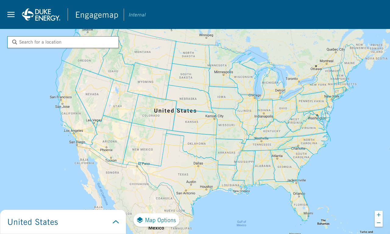
United States View
This view would show cumulative data for the entire company. There is a facility view that breaks down the number of Duke Energy facilities by state.


State View
This view only shows information within the state that you selected.
State Data Summary View
This view allows you to compare data side by side in a table format. Because this view was not in our design system, I had to create mobile versions of the interaction.
County View
This view only shows information within the county that you selected.
Markers, & Clusters, & Statuses, oh my!
For consistency, I used the markers, clusters, and statuses established in our Electron Design System.
Facility View
This view allows you to see where our facilities are, how many employees still work there, and whether or not the facility is in use or being renovated or retired.
Employee View
This view shows where Duke Energy Employees live. For privacy reasons, we only show this data at the ZIP Code level.
Shaded Region View
For Property Taxes, Foundation Spending, and Philanthropy, we designed a “shaded view” to show where Duke Energy had the greatest impact. In reality, this view ended up not being that useful because we spend a significant amount more where we have our corporate offices and facilities. It was very difficult to get the scaling to work appropriately.
Menu
This menu allowed users to see the Data Sources, Job Aid, FAQ’s, Map Tour, and various additional resources that may be helpful.
Lessons Learned
This project was a success because we had a robust starting point with our Design System and talented developers. Stakeholders were also comfortable working within the agile methodology which allowed us to focus on delivering working software every week and even received feedback from stakeholders before the MVP was officially released.