

Duke Energy
Performance Intelligence
Introduction
Duke Energy Wants to increase the efficiency of their renewable energy offerings by creating a online web application that monitors the efficiency of its renewable product offerings. These offerings are marketed as “Energy as a Service” and sold to companies like Amazon and Costco. The two main users for this product are Asset Managers and site managers. Asset Managers are looking at performance at a portfolio level while Site Managers are looking at performance at the customer level. The system is meant to service both types of users and allow them to customize a view that best meets their needs.

The Basics
Core Team
Product Manager (also subject matter expert)
Product Design Lead (me)
Engineering Lead
Data Science Lead
Front End Developer Lead
Backend Developer Lead
QA Lead
My Role
UX Design
UI Design (done with design system)
Interaction Design
Data Visualization
Persona interviews and synthesis
Story mapping
Conceptual model
Tools Used
Sketch
Abstract
Miro
Reference Customers
Stakeholder Map
Due to the size of the team, there were designated team leads who formed the “core team” and then the rest of the team would work with the team lead to intake their work. This allowed engineers to only attend the meetings that were absolutely necessary for them while the leads were involved with the strategic planning.
The Project Manager, who was also subject matter expert, brought in volunteers from the Sustainable solutions team for us to bounce ideas off of. This allowed us to co-create with these users by having regular touch-points with them whenever we reached a significant milestone.
The project sponsor was the head of the sustainable solutions department and would also be a reference user, although he was far removed from the operations day-to-day, he did monitor asset performance at the highest level and was an active participant in Discovery.


Desired Outcomes
Business Outcome
Improve the operating and performance of distributed energy assets by giving managers better tools and information.
Develop the infrastructure to enable planned future growth of the distributed energy business.
UX Outcome
Provide greater visibility into the performance of the portfolio to make maintaining more efficient the systems more efficient.
Key Performance Indicators
Decrease in revenue impact of lost production as measured in dollars
Employee effectiveness - qualitative feedback from users
Lean UX Canvas
For a project of this size, it is important to utilize all the tools in your UX tool belt. This is the slightly modified Lean UX Canvas that we settled on as a team. The screenshots in the Solution Ideas box were wireframes created in PowerPoint by the project manager. He had worked in this space for a long time and had many opinions on how this product should work.
Personas
After meeting with the project team and having a formal “kickoff” I immediately set up time to interview our reference users. While the Product Manager had a good handle of the problem space, I wanted to work backwards and identify the way these users tackled the problem, identify needs, pain points, and desires. I focused my interviews on behavior rather than ideal blue sky opportunities.
There are two primary users for this application.
Asset Managers - monitor performance of sites at a large scale. This could be at the region level or broken down by some other metric. They work with Site Managers by providing them the support they need, assigning them new sites to manage, and ensures that the contractual obligations of her sites are being met. They are more concerned with the financial performance of a portfolio of sites.
Site Managers - are the front line workers who respond to needs of individual sites. They still monitor dozens of sites at a time, but they are typically the ones who respond to calls and schedule site maintenance. They troubleshoot issues and closely monitor the sites from a output performance perspective.
Persona 1 - Asset Manager
Persona 2 - Site Manager
Conceptual Model
There are 1500+ sites located around the country (and more being brought online every month). Both user types care about a certain number of them. They would like to group these sites into “portfolios” so that they can better monitor the performance of the sites that they are responsible for. Performance over time, whether a site or a portfolio of sites, is critical for both user types to perform their jobs effectively. They both need to quickly identify trends and act upon them.
Story Map
This basic story map outlines the basic flow of the primary path. Most users are responsible for a subset of site. They will typically sign-in, view their default user-created portfolio, look for anomalies in portfolio performance, attempt to isolate the anomaly by manipulating various portfolio metrics, and drill down to the individual site(s) that are having issues. The user can then take action to schedule work orders, or order new equipment etc..
Information Architecture
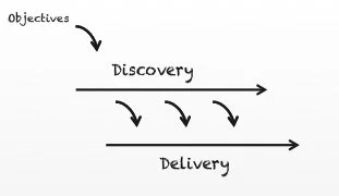
Once we felt as though we had a good grasp of the problem space, we began moving towards the solution space. We collaborated as a team to define the information architecture of the Performance Intelligence work tool. We knew that “portfolios” was going to be core functionality to the tool and began working on that feature first. We ended up basically moving from left to right on this site map designing each feature in discovery, and then handing off designs to engineers the following sprint. Engineers were involved with the discovery process and were building API’s while we were validating designs. We were basically doing a version of Dual-Track Agile.
Wireframes
Early concepts
Lots of different wireframe prototypes were created to help us, understand the mental model of Performance Intelligence. The UI needed to be scaleable, and accommodate different levels of fidelity. I show this overview of some of the wireframes that made it into digital format.
Portfolio Overview Concept 1
Individual “Site level” Concept
Portfolio Overview Concept 2
Portfolio Overview Concept 3 - Metric Selection
Portfolio Overview Concept 3 - Column selection
Final Designs
Process
Once we had a good handle of what we were building, we worked through the feature list one by one rapidly prototyping and iterating upon user feedback. Once the designs were finalized they were immediately picked up by front-end development for building.
Feature list
Portfolio
Create portfolio
Solar and Energy Storage sites
Compare portfolios
Create an Alert
Edit portfolio
Delete portfolio
Sites
Search
Financials
Equipment

Portfolio
Challenge
Each portfolio could have up multiple asset types (solar, battery storage, sensors, etc.) Each of these asset types had unique information, data visualizations, and functionality.
Solution
I took a modular approach to the portfolio view. Each component was a standalone component and could be switched on or off (from the backend) depending on which view was being displayed. The navigation, “action bar” and footer were always shown and persistent throughout the portfolio experience.
Individual Portfolio (home page)
Create New Portfolio
Challenge
Through conversations with reference users, I discovered that Asset Managers spent a lot of time assigning sites to Site Managers. There are usually a handful of sites brought each month that were manually assigned to each site manager.
Solution
I created a way for users to filter sites during portfolio creation and select a setting that would allow future sites that met that filtered criteria to be automatically added to their portfolio.
Compare Portfolios
Challenges
There were multiple features on the “portfolios” page.
Comparing one or more portfolios to each other
Viewing user created “my” portfolios
Viewing all public portfolios
This presented a unique interaction component to the design. Up until this point, all components were simply listed out on the page.
Solution
This had three interactions in one. Originally I was going to keep “Compare,” “My Portfolios” and “Public” on the same page, but opted to break them out using the segmented control component from our design system, Electron.
Create Alert
Challenge
Anomaly detection is the number one thing that drives business value. The sooner users can fix a problem, the sooner Duke Energy makes money. Why put the burden on the user to find these anomalies? What if there was a way to let the system do the heavy lifting?
Solution
After talking to reference users, we came up with the idea of an “alert”. These alerts basically monitor data levels and send a notification to the user when a value is above, below, or equal to a pre-defined value. Users could set these up at the portfolio level or at the individual site level.
Site Details
Challenge
Just like portfolios can have a mix of solar and Energy Storage, individual sites can have a combination of both solar and energy storage on site.
Solution
I added a toggle to switch between asset types at the site level.

Reflection
This project provided a lot of unique challenges. Every pattern we introduced seemed to get broken at some point and had to be redesigned. Those iterations helped me grow as a designer and think differently about data presentation and the needs of highly technical users.
The co-creation with reference customers was a huge factor in the success of this product. Interviewing users at the beginning of a project is one thing, but continually engaging them throughout the process take your solution work to the next level.